What is Year-Up?
Yearup is a nonprofit higher education platform that provides a 1 year program for prospective students to receive high value job skills for free.
Understanding The Problem
The first step was to have a meeting with the Director of Experience Design & Strategy at YearUp to:
Understand what the problem is that we’re trying to solve (goals, milestones, deliverables)
Understand the company, its core values, & customer demographic information.
Source potential users to interview
Understanding the scope and timing of the project
Understanding their expectations for working together (contact, meetings, etc.)
Before our meeting, we created a document to outline our discussion goals and gather information from our meeting that we would need moving forward.
The Process
After the client kickoff, we proceeded with the Design Thinking framework to complete the project. My process will differ depending on project goals, business needs, problem complexity, time, etc...
Design & Business Goals
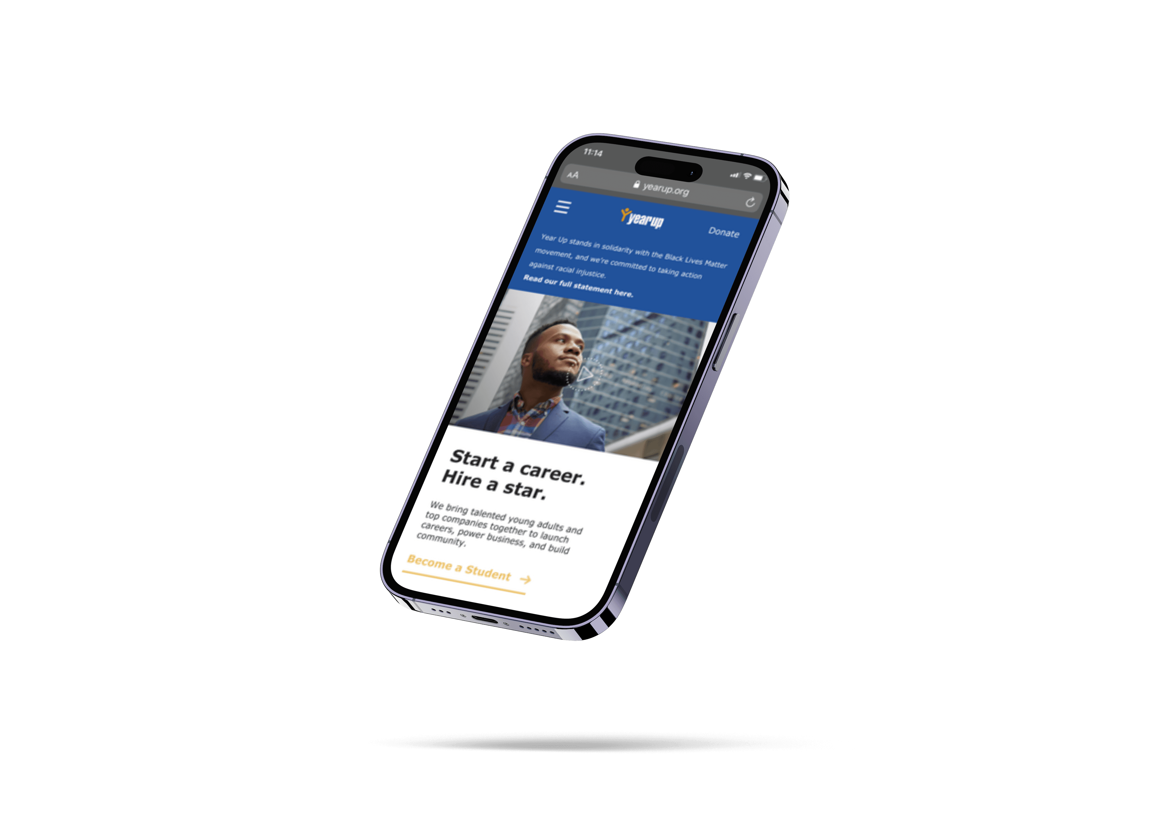
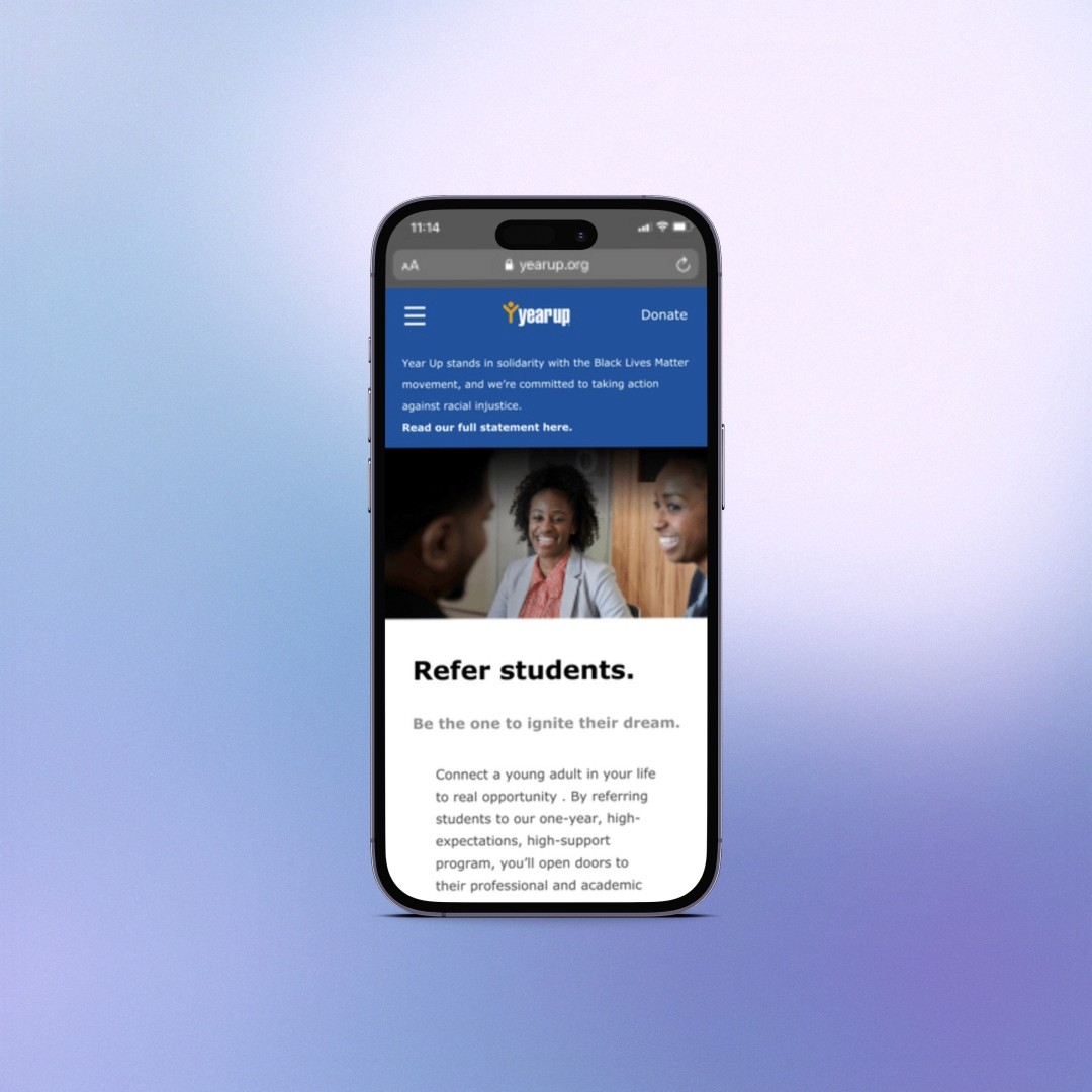
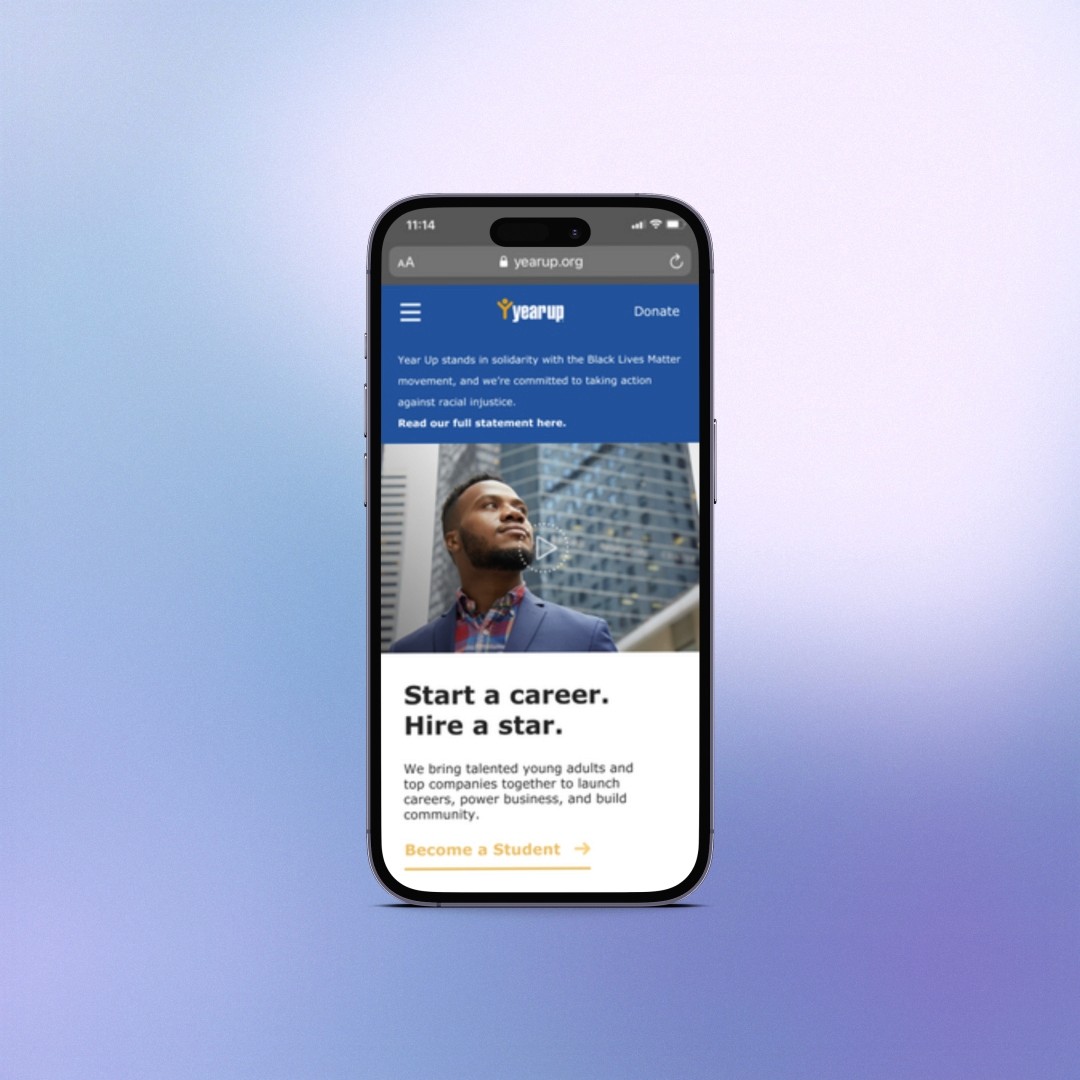
Increase the number of referral forms that are submitted through yearup.org.
Make the referral form more accessible to increase the number of referral forms that are submitted through yearup.org.
Increase engagements with referred students.
Decrease the time it takes enrollment staff to learn of new referrals, understand the status of a referral, and send follow-up communication with referrals.
Develop an automated referral system to decrease the time it takes enrollment staff to learn of new referrals, understand the status of a referral, and send follow-up communication with referrals.
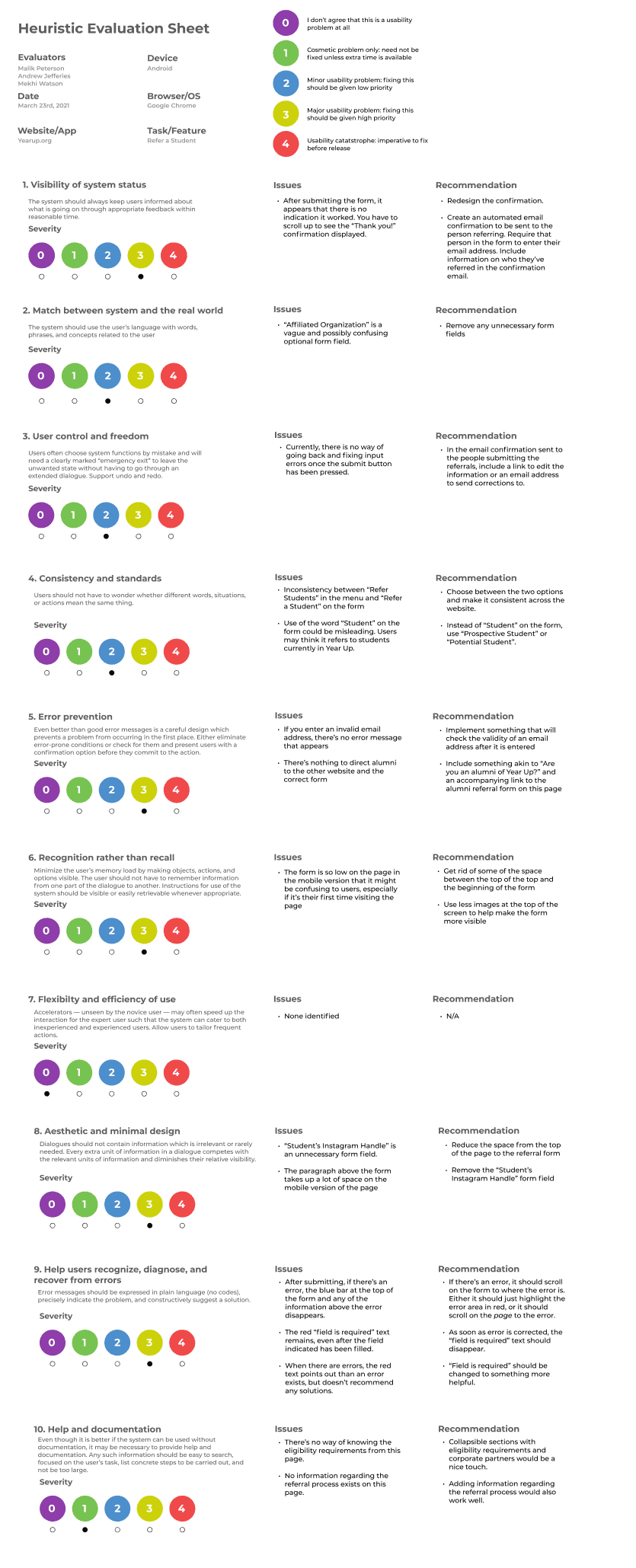
Heuristic Evaluation
As the first step of the redesign process, I evaluated the YearUp mobile website referral form with the heuristic review method. Some of the biggest problems we found :
No confirmation once completing the referral form.
No CTA for referring students anywhere on the homepage.
There are no eligibility requirements for admission on the referral form.
After the evaluation, we added recommendations for each criterion we used for evaluating the current design.
User Interviews
To evaluate the referral process on the YearUp mobile website, we relied on user interviews. This allowed us to gain a deeper understanding of the characteristics of our users, their goals, and their pain points. Due to time constraints, I was able to interview:
4 students referred to Yearup.
4 Year Up alumni.
3 Year up staff members on the recruitment team.
Below are Some of the research questions I asked for each user group:
Research Questions (Referred students):
How did you find out someone referred you to Year-up?
What were your impressions of the referral process?
Did Year-up ever contact you? How was that experience?
Research Questions (YearUp Alumni/Referrer):
Have you recently referred someone to Year Up? How was your experience?
What communication did you receive from Year Up as the person who referred someone else?
Was there anything confusing about the referral process for you?
How did you find Year Up in the first place?
If you were referred to the program, what was your experience like with that?
Research Questions (YearUp Staff):
How is information shared with the team?
What data can you give us on contacts and turnovers?
How much of a delay is there on average with follow-ups as of now?
How could your work be made easier?
How is the process of receiving referrals?
What gaps do you see in the referral process?
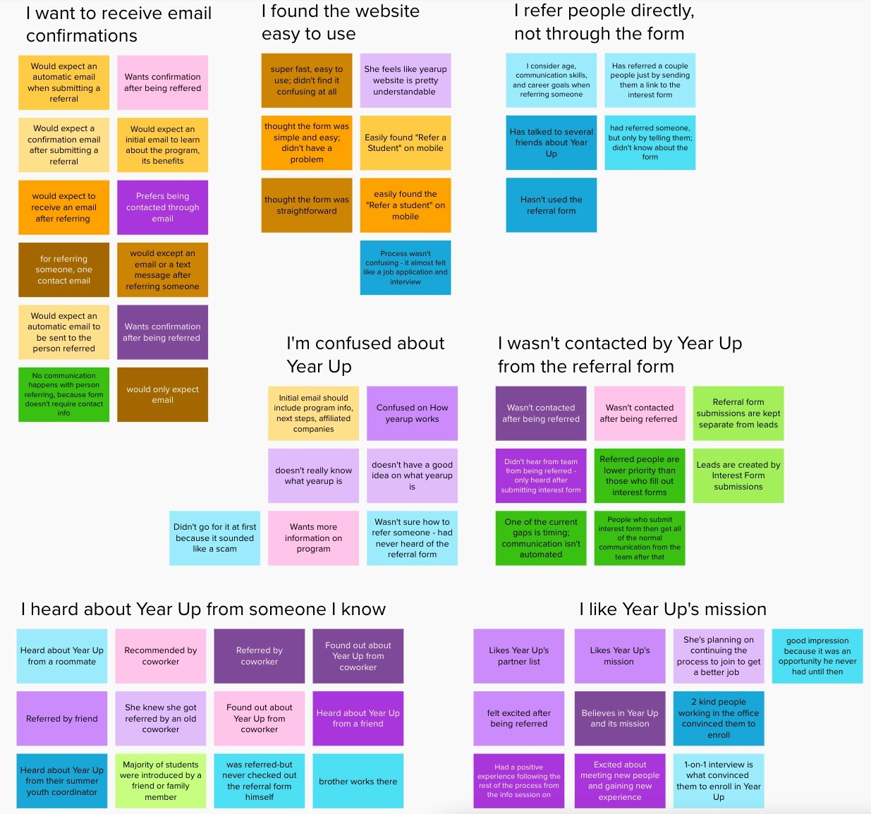
Synthesizing Data
After gathering all of the responses from our User interviews we did an affinity mapping exercise to synthesize our findings. Some of the major themes we found were:
Users wanted to receive an email confirmation after completing the Referral form.
Users found the form not easily accessible.
Most users were never contacted after being referred and would like to receive more confirmation after completing the form.
Users did not find a lot of information about Year Up on the referral form.
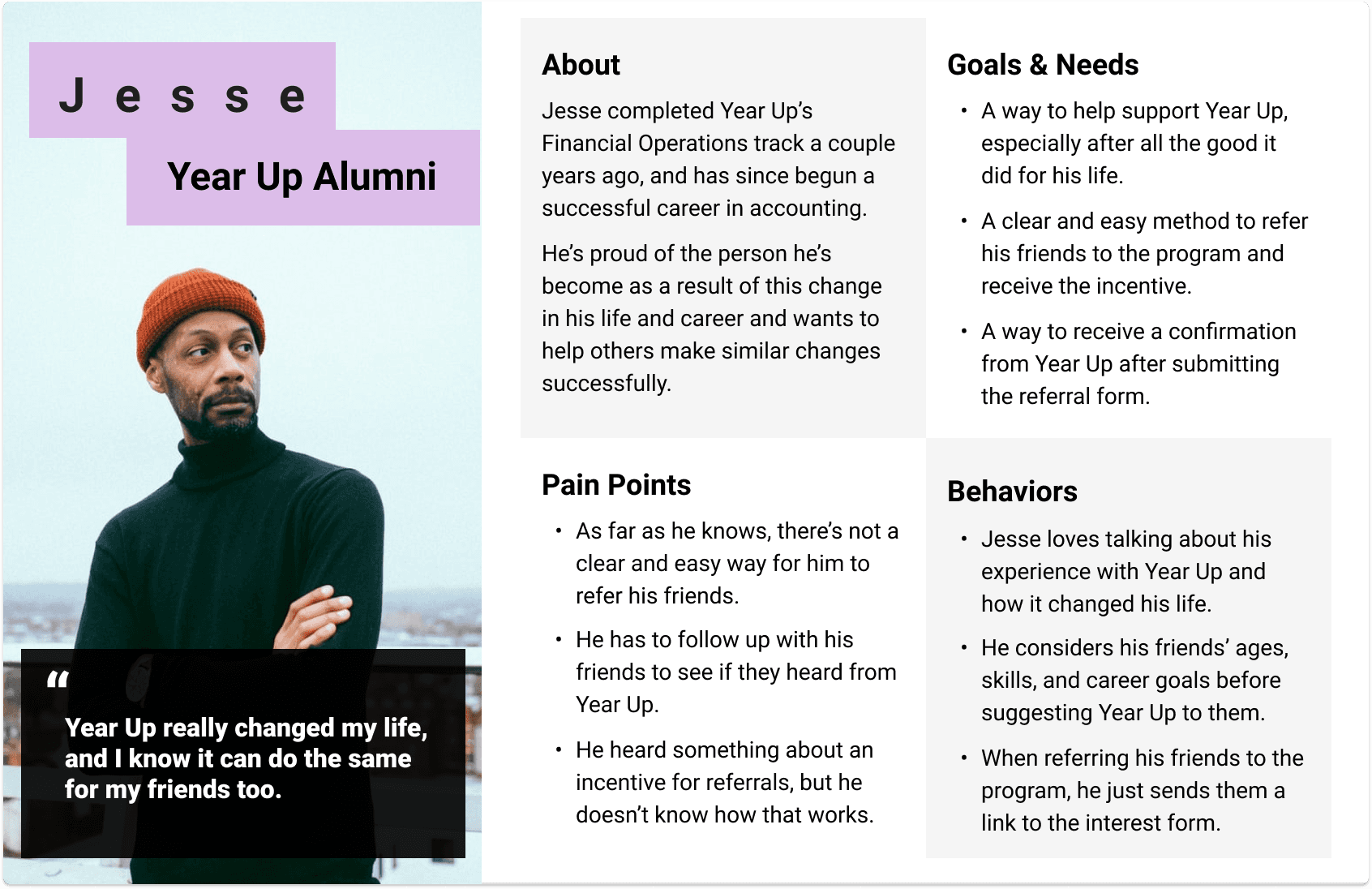
Personas & Problem Statement
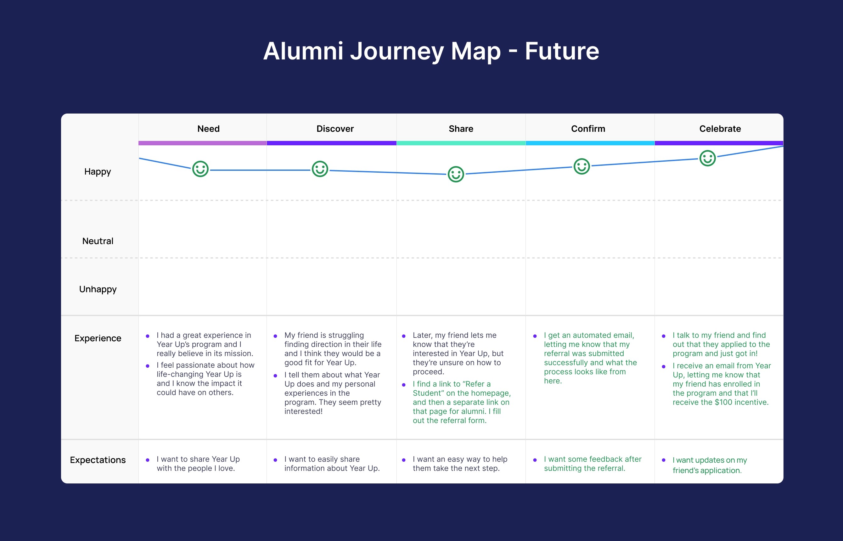
Journey Maps
To understand how the YearUp Alumni interact with the referral process I created 2 User Journey Maps. One for the current method of Year-Up Alumni and one for the future process we hoped to create with our new design. The user journey was divided into 5 steps:
Need
Discover
Share
Wait
Hope
We chose to create User journey maps to gain a better understanding of some of the alumni's main pain points such as:
They want to easily refer and share information with their friend; however, there is no option for referring students on the Year-up homepage.
Their only solution is to share the interest form with their friend however they never receive confirmation that they filled out the form and have no way of receiving credit for their referral.
Now they wait until they can reach out to their friend to see if they went through the process.
To solve these issues I created a new journey map highlighting how our new design would make this process easier for the alumni to receive confirmation and compensation for their referral. Some solutions we found were:
Creating a clear CTA for referring a student on the homepage
Adding an email address field to the referral form so the alumni can receive a confirmation email for their referral.
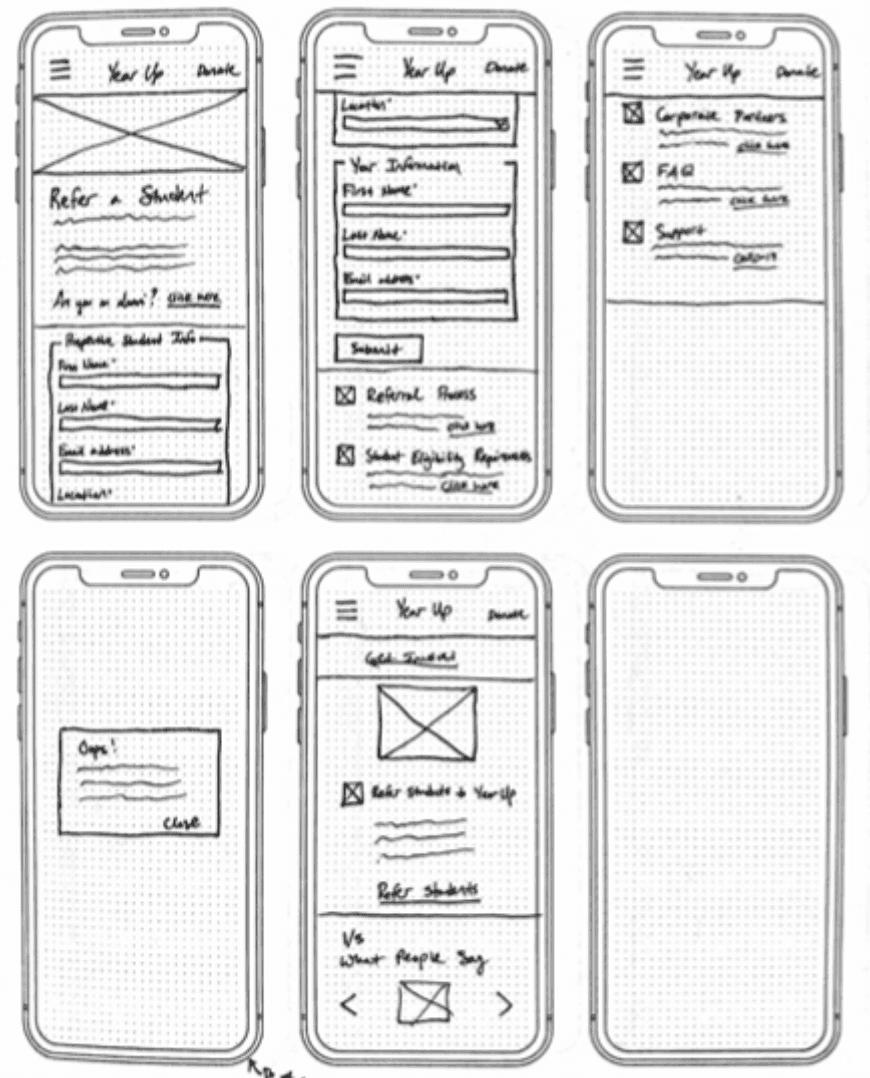
Sketches
toI created sketches in order to test ideas quickly before moving into Figma and creating wireframes.
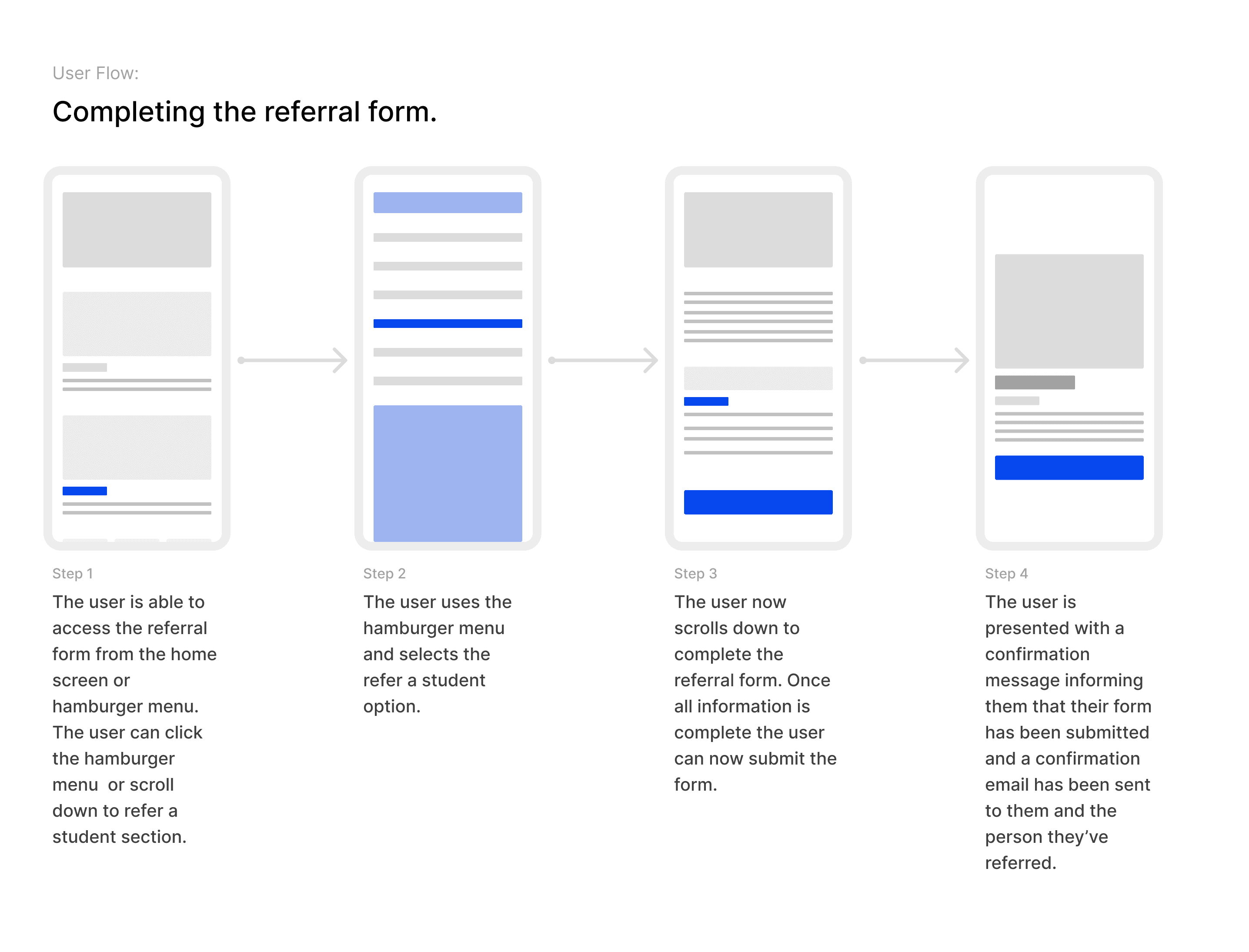
User Flows
I created user flows to address the needs of each persona for the prototype of the product.
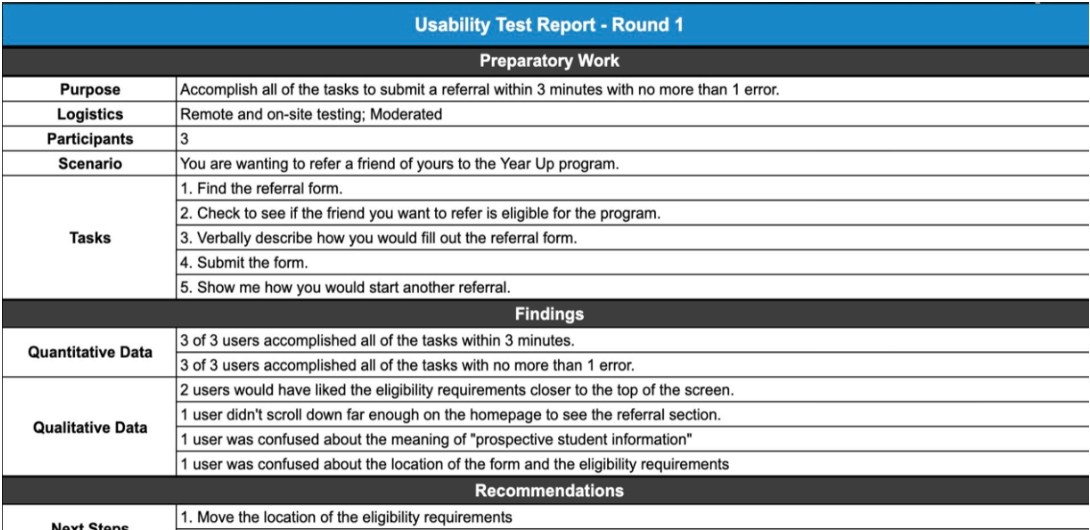
Usability Test
From the user flows, I created and tested a few different low-fidelity flows in Figma. The goal was to test ideas quickly and see which made the most sense to users. I was able to choose which set to go with because 5/5 users were able to complete all three tasks. After that was settled, I moved on to a medium-fidelity prototype.
During moderated usability testing sessions, I asked the users to complete five tasks.
1. Find the referral form.
2. See if the friend you want to refer is eligible for the program.
3. Verbally describe how you would fill out the referral form.
4. Submit the Form.
5. Show me how you would start another referral.
5/5 users completed these tasks in under 2.5 minutes, but I got feedback for iteration before high-fidelity mockups were made.
Visual Design Research
I did additional research on visual design for forms to understand best practices when designing for forms. I primarily looked at form designs from Apple and Google because they are the best examples on the market. I also pulled inspiration from sites like dribbble and Behance before finalizing the high-fidelity prototype. dribble
The Solution
, Below is a video of the high-fidelity prototype I created for Year-Up's mobile referral form. In the video I explore the home page, find the referral form, complete it, and return back home.
Testimonial
"Thank you again for all the work you did for the refer a student experience. We really appreciate the insights. In fact, I am going to get in touch with the development team this week to see if we can add these features to the refer a student page!"
Heidi Austin
Director of Experience Design & Strategy at Year-Up
The Result
This was my first "real world" project, I learned the importance of collaborating with stakeholders throughout the design process. In the end, the client was satisfied with the work we had done and we ultimately were able to help people.